A Customizable Planner App Without the Settings Maze
The Settings Trap Most Planners Fall Into
You open a new planner app. It needs to feel like yours before you start dropping tasks into it. So you click Settings on a customizable planner app and brace yourself.
Sixteen tabs. Four toggles that don't explain what they control. A "Theme" menu that leads to a paywall. A font picker buried three levels deep inside "Appearance > Advanced > Typography." Forty-five minutes later you've changed your sidebar color, broken your notification schedule, and given up on everything else.
This is the settings maze. Almost every productivity app has one. The irony is that the apps with the most customization options often produce the most generic-looking setups, because nobody can figure out how all the controls interact.
Weekloom's approach is the opposite. Personalization should take two minutes, not two hours. Pick an accent color. Pick a font. Choose light or dark. Adjust how visible you want the grid. That's the whole list. Every change reflects on your board immediately, so you see it before you commit.
Small scope by design. It covers the choices that actually matter for daily use. Everything else, like transitions, icon sets, dashboard widgets, and notification badges, is noise you'd configure once, forget about, and never touch again. We didn't build it.
Accent Color: The One Customizable Planner App Choice That Changes Everything
An accent color does more work than it looks like. Buttons, active states, step checkboxes, deadline markers, the today-column highlight: they all pick up whatever color you set. Change it once and the board shifts its entire personality.
Weekloom ships with a pink default (#ee519c). Not everyone wants pink. The picker lets you drop in any hex value or choose from a curated set of presets. If your aesthetic is indigo, or you want something quieter like slate, or you're building a work setup that matches your company colors, you set it once and forget it.
The practical effect is one most people don't expect: your eye learns where to look. After a week of using a consistent accent color, you stop consciously noticing it. Checked steps glow in your color. The current-day column has your tint. The interface becomes background noise, which is exactly what lets you focus on the actual work.
There's a research-backed argument that personalized environments increase a sense of ownership and engagement with a task. The effect size is modest, but the intuition is sound: you take better care of things that feel like yours. That applies to planners as much as anything else.
A practical note: very light accent colors (pale yellow, near-white) can cause accessibility issues against white backgrounds. If you pick a light color and notice the active-state text is hard to read, go slightly darker. The board will tell you quickly.
Dark Mode Planner, Light Mode Planner — Or Both
Some people run dark mode everywhere. Others find white backgrounds easier to read at a desk under bright office lights. A few flip between them depending on whether it's noon or midnight, or whether they're on a laptop screen versus a large monitor.
Weekloom supports all three approaches. You can pin to light, pin to dark, or let the board follow your system setting automatically. The system-follow option is more useful than it sounds. If your operating system switches to dark mode at sunset, your planner does too without you thinking about it.
The dark mode palette in Weekloom isn't just an inverted white. The background is a true near-black, the gridlines drop to a very low-contrast gray, and text sits at a comfortable off-white rather than stark white. Reading task labels at 11pm on dark mode is noticeably easier than squinting at a bright white grid.
Light mode keeps the board minimal: white cells, barely-there gridlines, task labels in dark gray. It also captures cleanly if you screenshot your plan to share in a meeting or paste it into a document.
Switching between light and dark takes one click. No page reload, no restart, no confirmation dialog. You click, it changes. That sounds trivial but a lot of apps don't manage it. They either require a restart or they apply the change to a settings page that doesn't actually preview how your board will look.
For a dark mode planner, the real test is whether the low-contrast grid still reads clearly enough to parse your week at a glance. Weekloom's dark theme clears that bar.
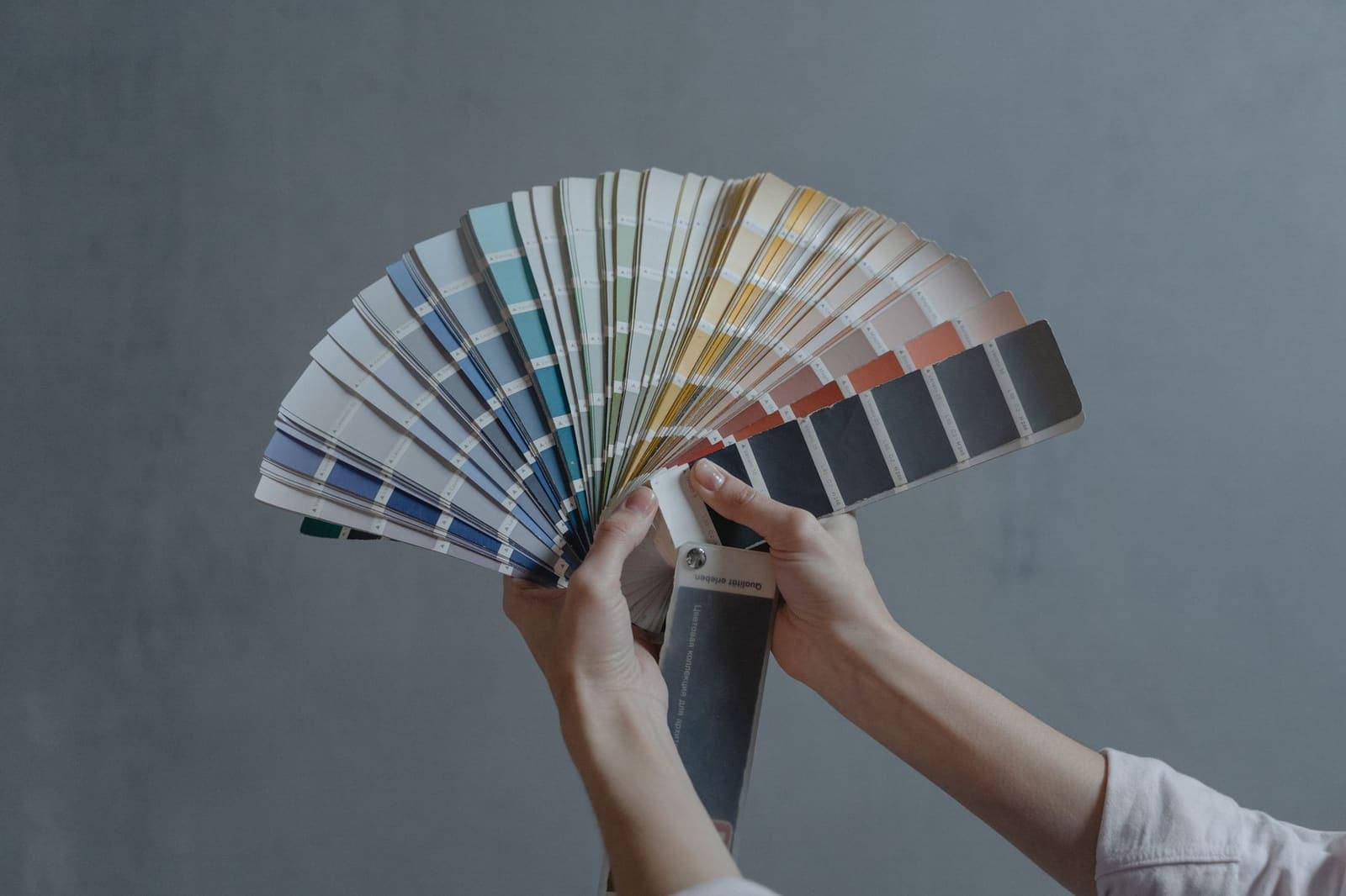
Google Font Presets That Don't Require a Typography Degree
Font choice is where a lot of apps either go overboard (offer 300 Google Fonts and watch users spend 20 minutes deciding) or don't bother at all (you get Inter, deal with it).
Weekloom takes a curated middle path: a small set of Google Font presets, each chosen because it works well at small sizes in a dense planning grid. The options cover a few distinct personalities. There's a clean geometric sans for people who want the app to feel precise and modern. A slightly warmer humanist sans for a less clinical look. A monospace option for people who want that developer-notebook aesthetic where columns feel especially crisp.
You pick one and the whole board re-renders. That's it.
Why presets instead of an open picker? Because open pickers produce decision paralysis. I've watched people spend 20 minutes on font choice in Notion and still end up with the default. A short list forces a quick decision and moves you forward.
For a Google font planner experience, the key constraint is legibility at small sizes. A beautiful serif that works in a long blog post falls apart at the 13px label size on a step cell inside a day column. Every preset in Weekloom has been checked at those sizes so you won't pick something that looks great in the preview and terrible in actual use.
This is one of those "boring problem solved" situations. Font choice is worth having control over. The same plan feels different in a geometric sans versus a rounded humanist. But the decision should take 30 seconds. Presets make that possible.
Gridline Opacity: The Setting Nobody Talks About
Here's one most planner apps don't offer at all.
The grid structure of a personal Gantt board (tasks running down the left, days running across the top) is useful for reading across rows and down columns. But some people find a high-contrast grid visually cluttered. Others want strong lines to anchor their eye on a dense week.
Weekloom lets you set gridline opacity anywhere from invisible to fully visible. At zero opacity, you get a minimal whitespace layout where the task rows seem to float. At full opacity, you get a clear spreadsheet-style grid with defined cells. Most people land somewhere in the middle without much deliberation.
The effect on how a board feels is larger than you'd expect. A visually heavy grid creates cognitive pressure. You start scanning lines instead of reading task names. Dialing the gridlines back, even just to 60% opacity, lets the actual content dominate.
Weekloom's default aesthetic is already flat and minimal (no drop shadows, no gradients, very little ornamentation). Even at full gridline opacity, it doesn't feel heavy. But if you want to push toward a cleaner look, the slider is there.
Paired with the accent color and font choice, gridline opacity is the third control that lets you tune visual density to match how your brain likes to process information. Dense grid, warm font, muted accent: one kind of planner. Invisible grid, geometric sans, bold accent: a completely different feel. Same data either way.
How Personalization Fits Into the Actual Planning Habit
There's a legitimate case for spending zero time on customization. Open the app, start planning, never look at settings. Plenty of people do this and plan just fine.
But there's also something real about making a tool feel like yours before you commit to using it daily. It's the same reason people buy a quality notebook before starting a journaling practice, or set up a clean desk before a long work session. The environment signals intent. The research on this is uneven, but the behavioral pattern is consistent enough to take seriously: when you invest a little in setup, you're more likely to return.
For a customizable planner app, the right balance is: fast enough that you don't lose your afternoon to settings, deep enough that the result actually looks different from the default. Weekloom's personalization panel is designed to take about two minutes on first use and then disappear from your workflow entirely.
After that, everything you interact with is the plan itself. The accent color, the font, the theme: they fade into background. What stays is whether your tasks are broken into concrete daily steps (something covered in more depth in how Weekloom handles per-day checkable steps), whether your board is organized into scannable groups you can collapse when you need focus (see organizing tasks into color-coded blocks), and whether you actually sit down and check things off.
Personalization makes returning to the board slightly more likely. A board that feels like yours is one you open without friction. But it won't rescue a broken planning system on its own. The structure has to be right too.
If you want to try the board before committing to any of it, the Weekloom demo runs without an account. You can play with the accent color and themes there too, before you've signed up for anything.
The one concrete thing worth doing first: set your accent color and pick a theme before you add your first task. It takes 90 seconds. Then close the settings panel and don't open it again unless something specific bothers you. The settings maze doesn't have to follow you here.